
Evan Barosay
2 Weeks
March 2017
Human Factors Engineering
Sketch
Usability Architecture
Human Error Design
UI Design
About
Introducing: Mercury°. After taking a human factors engineering course,
we were tasked to develop a digital thermostat interface while keeping human error
and human factors in mind. Although an engineering class, there were multiple
overlaps with human-centered design. For my digital thermostat,
I strived to create a simplistic interface that was able to simultaneously
include multiple features and functions.
My Role
This was an individually based project, so everything from the design to the
background research to the reasoning behind the decisions was my
personal choice.
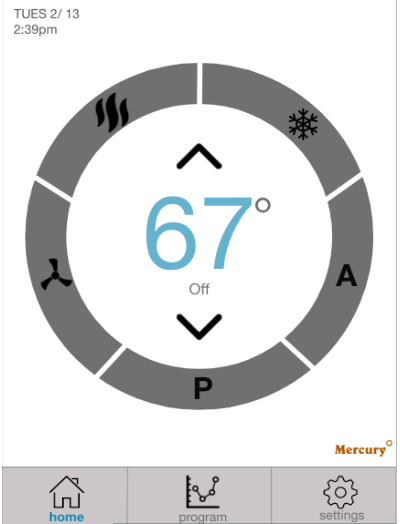
Operational Display
To the right shows the interface in OFF mode. The design will still report the current room temperature (67°) while no settings are turned on. I chose to display a digital reading rather than a typical thermometer scale due to point reading and task representation compatibility. I chose to display the current temperature large and in the center of the interface in order to accomplish visibility of the system status. Additionally, there are up and down arrows to change the temperature by one degree. I decided to place these arrows far away from each other (one on top of the number, and one below) so that no one would make a slip and accidentally press the other arrow because they are in close proximity (also known as the fat-finger error).
On Mode
If someone changes to a desired temperature, it will be reflected in the bottom right of the temperature number as the system is adjusting. This allows user to see room temperature and to remind them what the system is working to adjust to. In the top left-hand corner, there is a static report of the current date and time that will remain constant on each screen. Additionally, there is a static navigation bar at the bottom that allows easy mobility for the users for the three main categories of functions: Home, Program, and Settings. Currently, the screen is on Home. The Home screen is where users can view and control all the main functionalities for the thermostat. When a user wants to go into heating mode, cooling mode, auto mode, program mode, or turn on the fan, this screen and dial gives the user accessibility to do so. The figure shows the status of the system when two modes (Cooling, and Fan ON) are selected. To give the user feedback, the cooling section and fan function will be highlighted blue. Additionally, the words under the temperature will change from OFF to Cooling, and Fan ON.
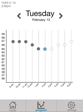
Program and Set Up Display
For the Program function, I did not want to clutter the home screen,
so used the second navigation tab below to indicate the current time and setting for the program.
The leftmost figure shows the Program Screen.
The date is clearly visible on the top, and the arrows give
the option to users to see the upcoming program settings as well as the past history.
The graph shows the temperature settings that are planned for the day.
A darkened circle indicates the time and setting has passed,
an empty outlined circle indicates that is the system plans for upcoming times,
and the current mode is indicated through a highlighted blue dot.
I chose a scatter plot due to task graph compatibility, for “integrated tasks benefit from integrated graphs”
meaning that this continuous data is better displayed with a scatter/line graph than pie/ bar graphs.
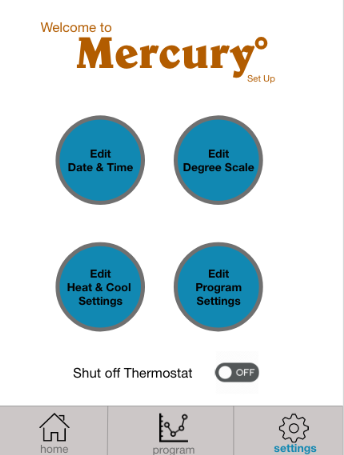
Set Up Display
The third section on the navigation bar is Settings.
Settings allows user to access any set-up details and to edit any of the functionalities.
The main screen that appears when the user chooses the Settings button.
To change the date or time, for example, the user simply clicks on the upper-left
button and is directed to a screen that allows the user to edit the day or time.
“Edit Degree Scale” and “Edit Heat & Cool Settings” follows similar
protocols and can be seen in Figures 3.1 and 3.2.
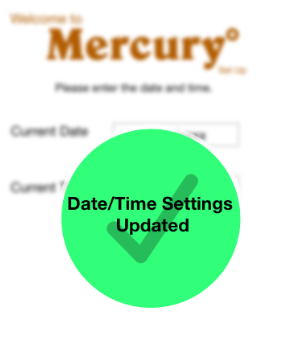
Additionally, when there is any change made there is a
feedback message that pops up to tell the user that the system has
registered these changes.
Additional Rationale for Design Choices
Feedback
To ensure users that their adjusted changes were recorded for, I added feedback messages validating that the recent changes were saved and newly implemented.
Mistake Prevention
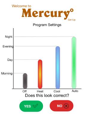
When a user is adjust settings, there should be a confirmation of what those new changes include before it is set in stone in case there is a mistake. I wanted to make the information visibly available, thus when a user changes programming settings, for example, the system will output a visual graph and ask the user to confirm changes.
Information Visibility
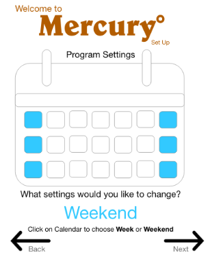
When a user is adjusting something such as days or times, text and numbers alone can be confusing and cause an error to occur. The calendar feature highlights the day and period of time that the user is selecting for easier understandment of the changes.
Warning Messages
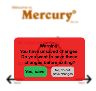
If a user is about to make a change that could cause further errors or drastic unexpected changes, there should be a warning message alerting them of the consequences. For warning and feedback messages, I used population stereotypes and color-coded particular messages. For example, for the warning message I used red since this usually indicates caution or stop. However, I did not want to solely use color as a crutch to get messages across. I additionally used icons on messages that helped indicate the system status.