
Evan Barosay
Brendon Taing
Judd Gatbonton
Carter Duong
Kaizen Chen
Than Khoa
5 Weeks
August 2017 ~ September 2017
Usability & Information Architecture
Web & Multimedia Design
User Interaction
High-Fidelity Prototyping
Transaction Design
Graphic Layout
My Role
UX Researcher, UI Specialist, Project Lead
As one of the UX Researcher, I helped gather critical user
information so that we could direct our project while addressing user needs.
We used surveys and interviews to collect data.
As the user interface specialist, I overlooked the overall design for
each aspect of the project, from logos to wireframes to
high fidelity prototypes.
This projects was the first I took part of the UI, whereas in the past
I take charge of research mainly.
As the Lead, I managed the project and team to ensure that
we were on track and completing deadlines. I faciliated assigning
tasks and kept others accountable.
About
Flow is a high-fidelity prototype developed in an usability and
information architecture class (COGS 187A). Our app goal was to make group work more enjoyable
and fair with our three main features: accountability, equal work, and collaboration.
Check out our Medium Blog!
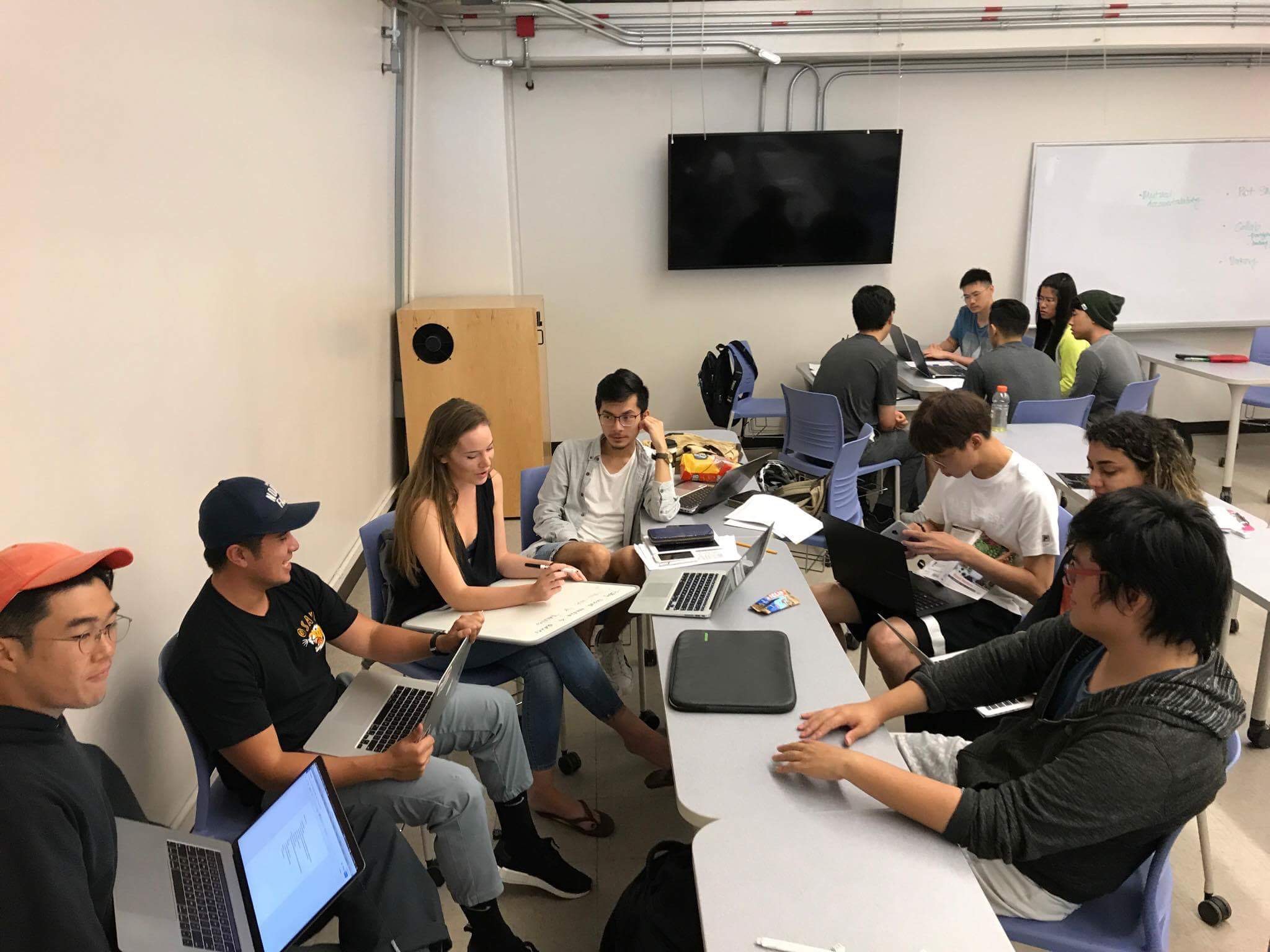
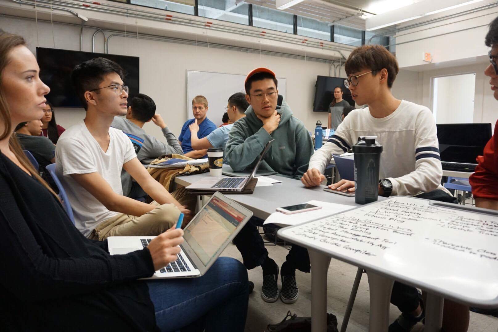
Brainstorming
The first task in our project was to come up with a direction for our high-fidelity app. We took part in a brainstorming session, and collectively decided that collaborative/group work is a trending matter that would lead us to an effective and popular application.
Low Fidelity Prototype
Storyboards
Our next task was to create a low-fidelity prototype. However first, we wanted a clearer direction of our target users. We created multiple personas and storyboards to define our user audience.
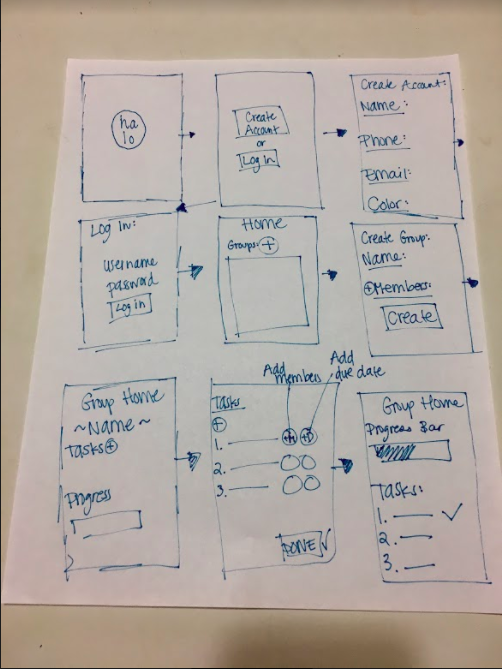
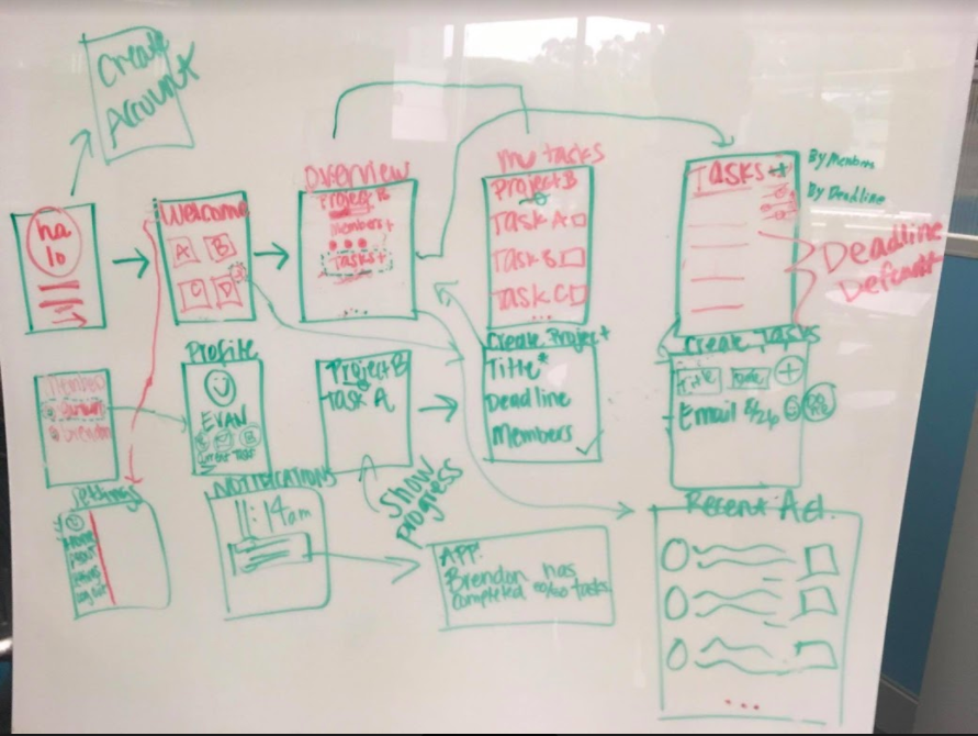
Paper Prototype
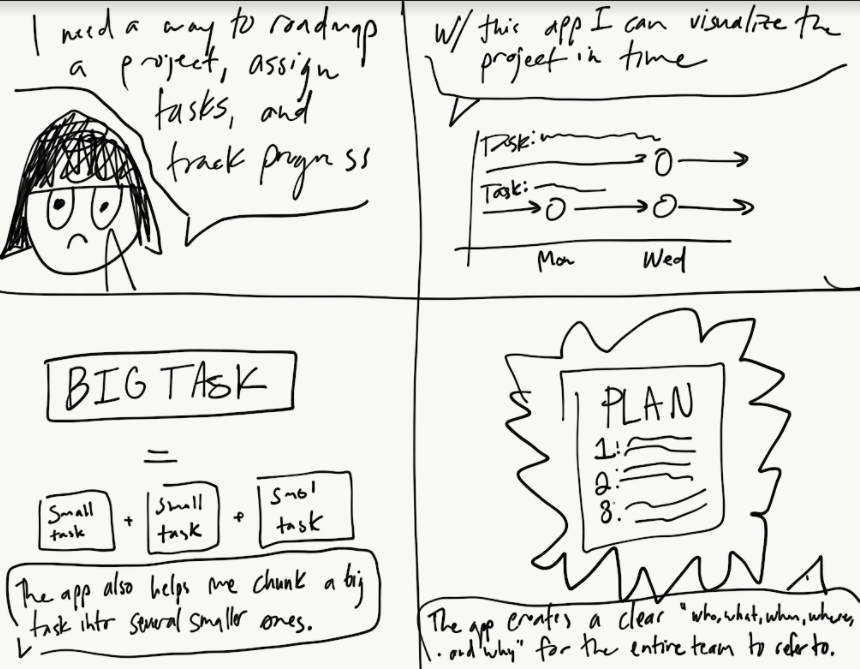
We were then able to move on to create a low-fidelity prototype. Using a whiteboard and then sketch paper, we created multiple variations of our app idea. Our team focused on creating an effortless flow of our app, to aide new users with navigating the app.
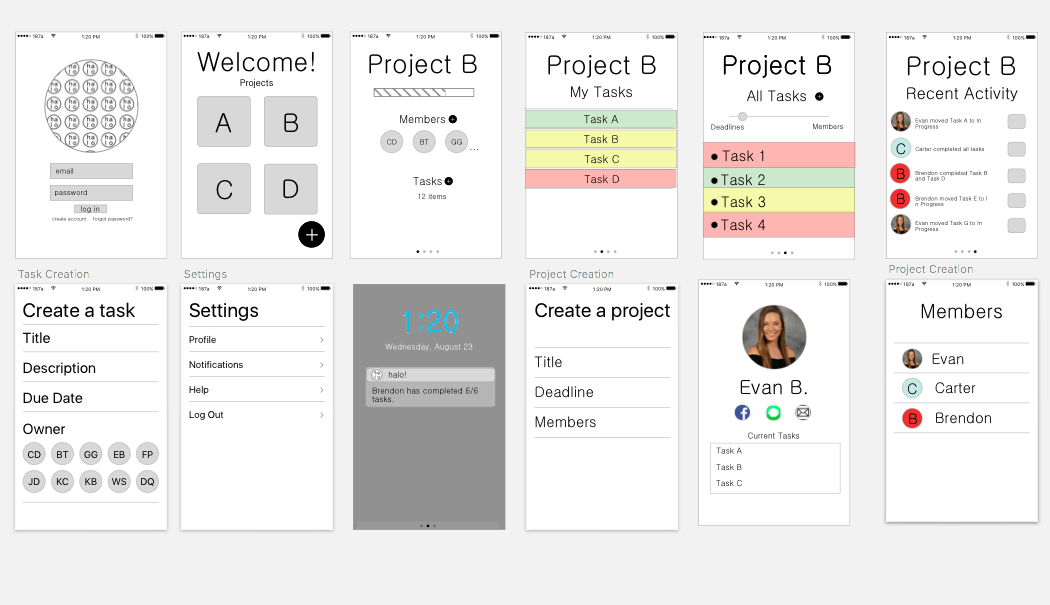
Sketch
From here, we user-tested with surrounding peers to see if there were any flukes before
moving onto a digital prototype using Sketch.
Iteration
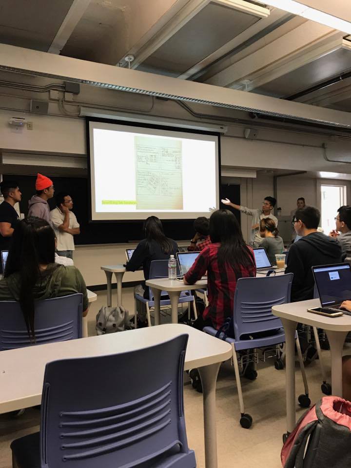
Class Feedback
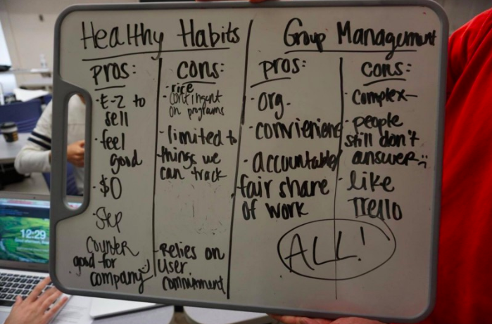
To gain more feedback, we gave a class-presentation of our personas, storyboards, and low-fidelity prototype. We gained valuable insight from our peers that we failed to recognize, for example, how our app varied from Trello or Slack. This had us go back to the white board to fix some critical errors before we jumped into user-testing.
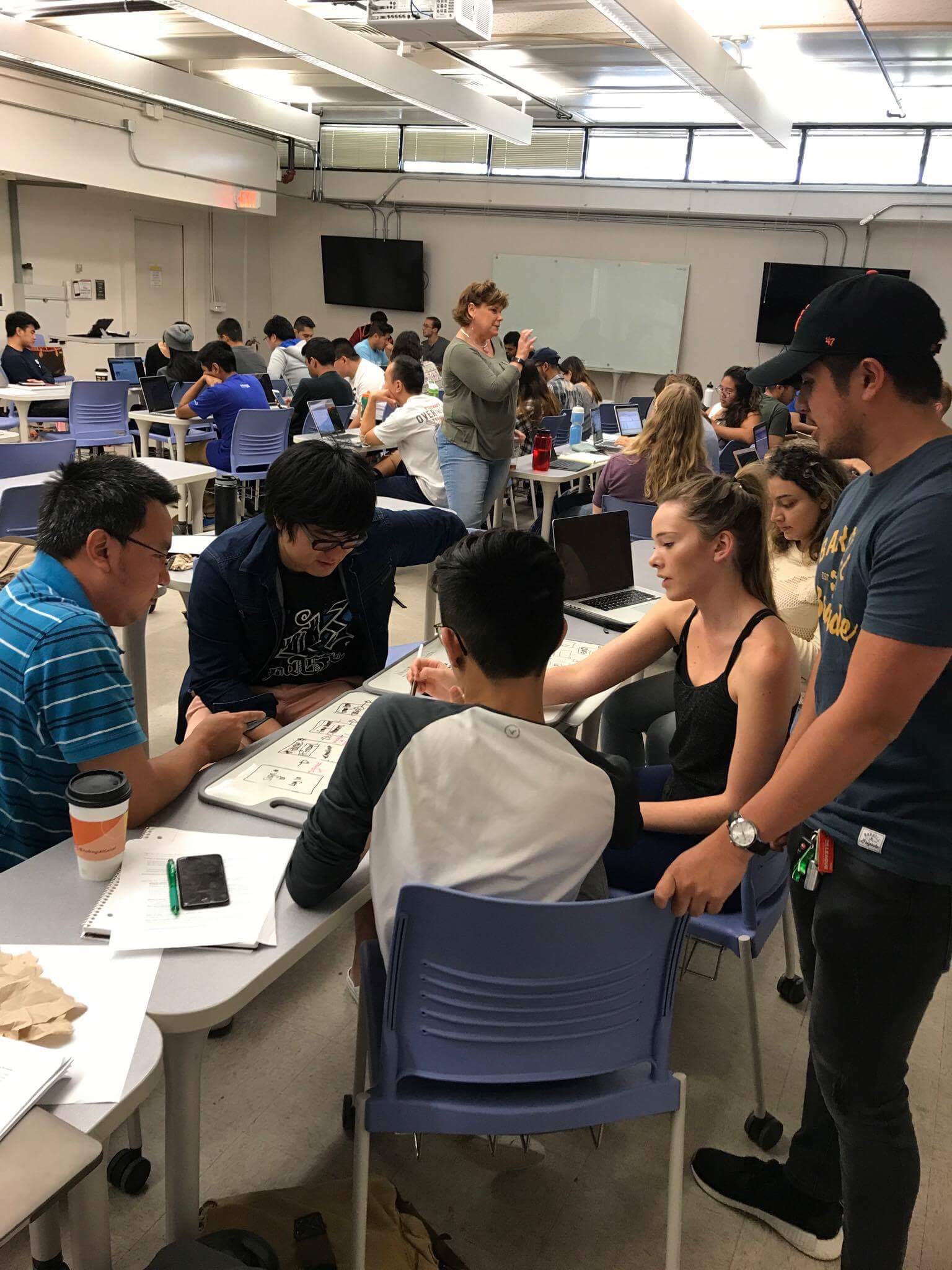
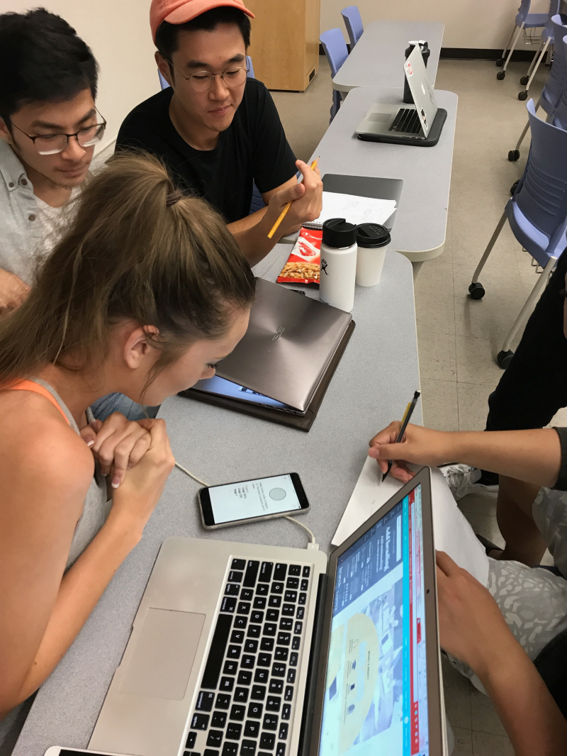
User Testing
To user-test, our team split up into two groups and collaborated with another group of peers. From the feedback we recieved, we realized that the icons we chose and the navigation that we created were not as clear or intuitive to other users. Users complained that the visualization of task completion was too confusing. Using colors to denote status resulted in multiple subjective readings and users found the navigation between screens to be unintuitive. Furthermore, we learned about features that people wanted, such as a better way to communicate via comments and activity logs.
Feedback
From our inital low-fidelity prototype user-testing, we had a list of factors to iterate on. Our main points to focus on were having unique features to stand apart from competing applications, overall navigation, and clearer icons and colors.
Version 2
After a few brainstorming sessions, we decided that our main pillars to make our app unique in the market would be accountability, equal work, and collaboration. We added a rating feature to each task. By rating the difficulty of each task, the app can calculate the amount of work that needs to be done by each user to result in a roughly even d istribuition of work. Users who had done less work would see their score in relation to others in the group, and would feel the social pressure to balance the spread. We also added a chat feature to open up ways of team collaboration through the app. We additionally changed icons and the color coding on the task page so it was more inline with a user's mental model.
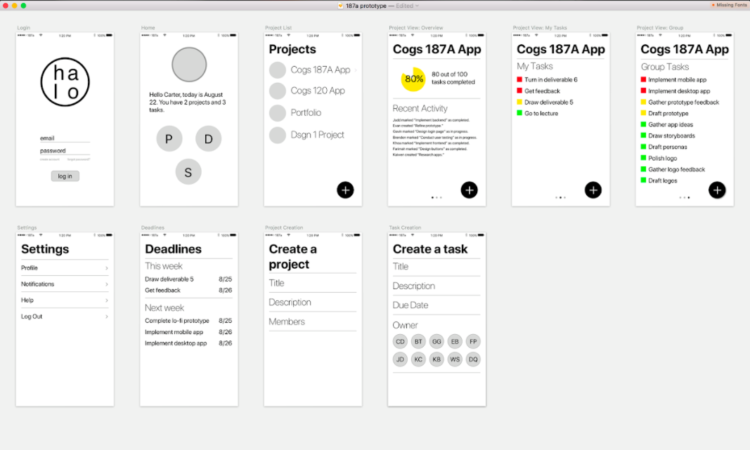
High Fidelity
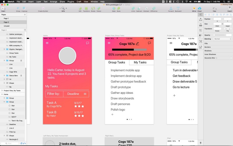
Wrapping Up
After getting the main functionalities and unique characteristics settled, we focused on creating an appealing UI and implementing a final high-fidelity prototype. We used Sketch to create our interface design. Our final version of Flow was a high-fidelity prototype that allowed users to log in and access group projects they were currently tasked with. Users would be able to add teammates to a project and distribute tasks. As an individual user is assigned more tasks, there is an indicator on their profile to show how much of the project they are responsible for. We hope this feature would help as users continue to distribute tasks, so that they would recognize when certain teammates have more work than others. We also had a chat feature so that the team does not to navigate away from our application to communicate about the project. Using an online deployer, we were able to upload our Sketch interfaces and add interaction and functionalities to the screens. Take a look!